ChatGPT, are you proud of me?
AI is just a parent trying its best
I’m not convinced that spatial software is solving the problem of inadequacy in todays interfaces. I’m not even sure if it’s figured out the problem it’s addressing. I’ve never created a “knowledge graph” in my notebooks. I don’t think I’d use infinite paper much either - I get lost easily.
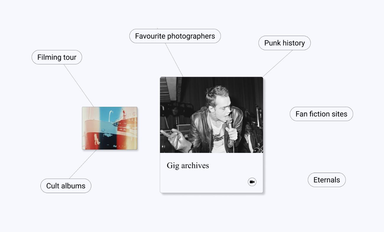
Yet there’s more and more software out there that claim it to be the next paradigm. Sane (see above), Kosmik, and Logseq all speak of some hidden but unlockable creative and expressive energy in organising the ‘infinite desk’. But I feel like it’s harder for even me to follow when it’s ‘spatial’, it’s like the creation is not quite done yet.
I think we just need to learn to write better. When I read I wander, I branch off. Each sentence in a way is non-linear internally, but their sequence is. They’re definitely not a graph though - there are no obvious steps. Like walking through a forest I end up somewhere. And honestly the forest itself has no story, only the destination and the decision to branch off.
I feel like the problem is that linear storytelling is not satisfying - whether it’s because it’s too long or because it doesn’t let us explore. But if you consider the best storytelling methods, they are methodical. All my favourite books have multiple threads in them, split into chapters; my favourite series is a web of threads that appear and are tied up. These structures engage us - the rhythm of stories gives us space to imagine and create our own hypothetical paths.
I do get the spatial trend though - the opposite of linear is perhaps spatial, or perhaps it’s the evolution from 1 dimensional to two dimensional. But I don’t believe the problem is the dimensions. Take this image of my post (🔌) on human-centred design below:
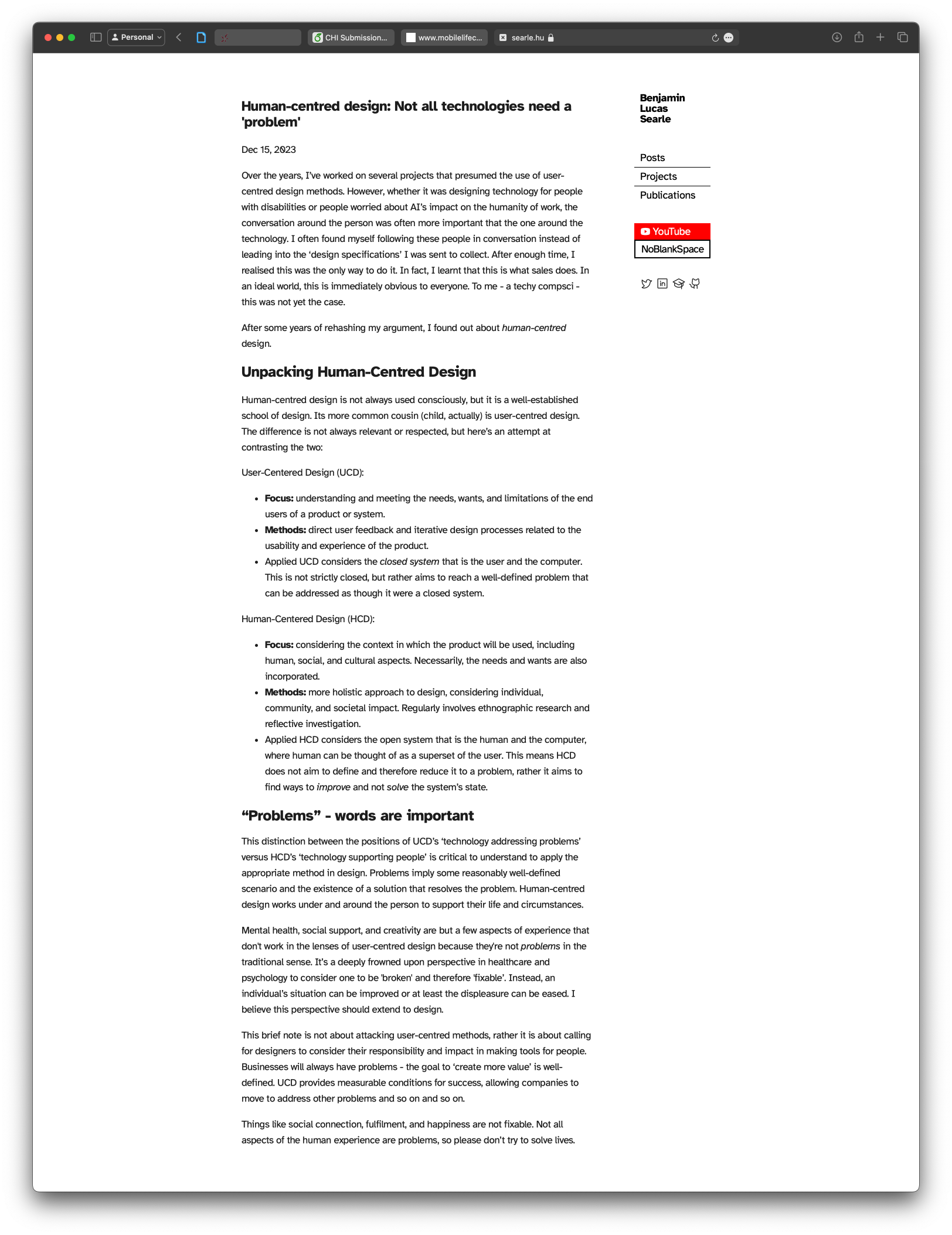
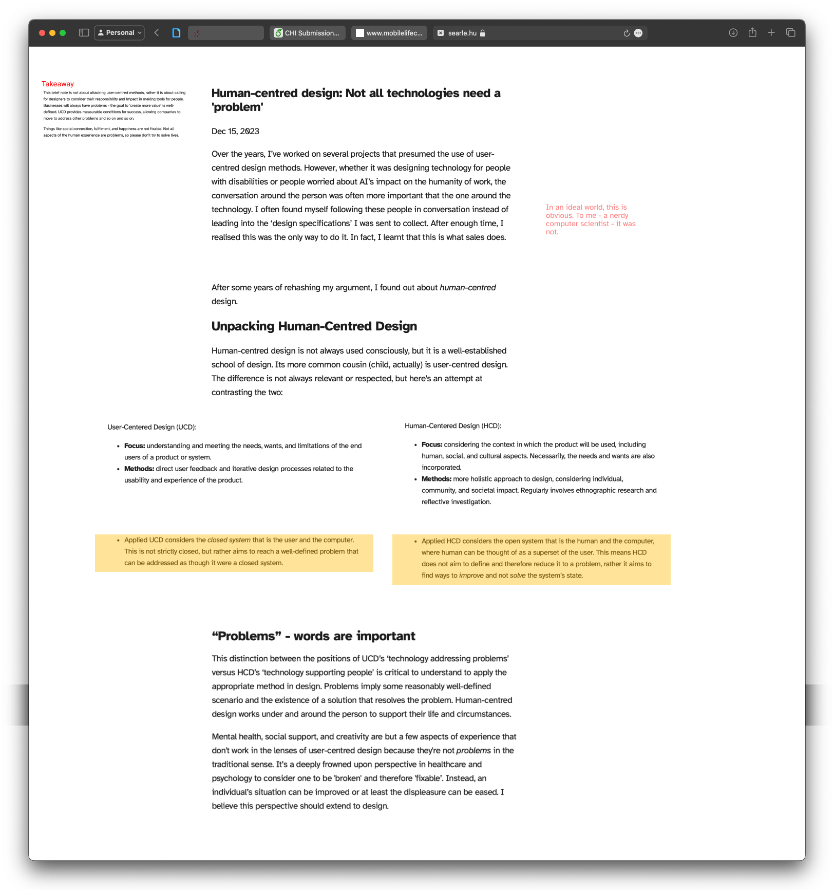
Its boring, its not exciting to read, my eyes are being lead not invited. Watch what happens if I ‘shuffle’ it up a bit, create some breadth, some things to find. Notice the use of the margins as background to the content that is the foreground. I can put my person and expression there. This is not new - its where the comments go in most notes apps. Like when writing on paper.
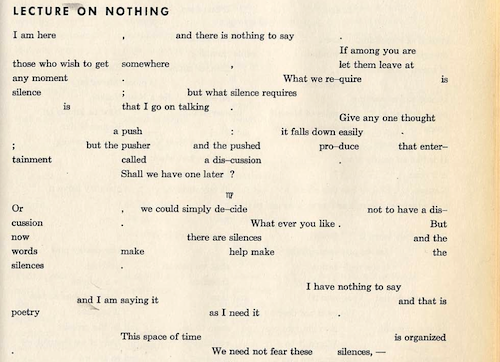
This is a tiny example, and perhaps not perfect either - the stories are always linear, we just don’t experience them that way. John Cage’s ‘lecture on nothing’ is an excellent example of adding rhythm to text.
I think it’s less about having everything there and more about their relationship to each other. It’s the space between the things that holds meaning and power.
I don't write on a schedule, but if you want to be notified when something new does appear there's a signup below!